BEST GUIDE TO HIP HOP EVENTS, SHOWS & CONCERTS x SOCIAL NETWORK
The Undying Legacy Of The Hieroglyphics Logo On Underground Hip-Hop Culture
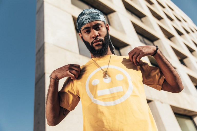
If you’ve been anywhere near hip-hop in the past 25 years, you’ve seen the Hieroglyphics logo before. Guaranteed. You know, the deadpanned circular face with three dots for eyes and a straight line for the mouth? Maybe you don’t remember the first time you saw it, because it’s just been everywhere. On a hoodie in the Bay Area. On a hat in New York City. A sticker on a bathroom wall in Chicago or even on a pair of skate shoes in Brazil. It’s global. And it’s come to symbolize much more than the Oakland-based Hieroglyphics crew that it represents. It’s become one of the rare symbols of hip-hop culture and style.
But how did an independent hip-hop crew formed in 1991 develop a ubiquitous logo that’s towered over most other hip-hop iconography since and still keep it fresh in 2020? The answer lies in an unwavering ethos of independence from the nine-member crew and in a fundamental design concept: Keep it simple.
“I was hella into counter-culture. ’60s rock…hippie era sh*t and funk. I was into that cause I was born in the ’70s,” says Del The Funky Homosapien, the eclectic Hieroglyphics MC and the artist behind the logo’s original design. “I wanted something like the yellow smiley face, but the way I drew it, with the third eye in the middle and a line instead of a smile, it indicated that you’re concentrating or something. I’m into graphic design and I wanted something simple like that. I doodled it on a napkin.”
Views: 84
Best guide to hip hop, soul, reggae concerts & events in San Francisco Bay Area, Los Angeles & New York City + music, videos, radio and more
Connect
Subscribe to E-Blast
WIN TICKETS
Steel Pulse
Thursday, Apr 18 @ UC Theatre, Berkeley
Mario Hodge
Saturday, May 4 @ Moose Lodge, El Sobrante
PJ Morton
Wedneday, Oct 23 @ Fox Theater, Oakland
Featured Content
Featured Videos
Photos
Groups
-
Venue Directory
10 members
-
Promoter Directory
49 members
-
Artist Directory
19 members
-
DJ Directory
46 members
Latest Activity
That moment when you show them what it took to get here….
Chicago/Atlanta, IL/GA — Powerful motivational single “On The Way” by Krys Barry is a whole vibe. That moment when others are made to understand the assignment. Come take the Journey through melodic rhymes with a gritty theme. Officially released 4/12/24, Krys Barry’s “On The Way” is a beautiful addition to the Rap genre. Available on All Platforms. A definite inspiration for anyone listening. Here to make the world believe. ”Get to the bag. Stay on the grind. I’m on the way.” – Krys…See More
KARYN WHITE
May 1, 2024 from 8pm to 11pmCHANTE MOORE
July 5, 2024 at 6pm to July 6, 2024 at 11:30pmTAYLOR DAYNE
June 7, 2024 from 8pm to 11pm
KARYN WHITE
May 1, 2024 from 8pm to 11pmCHANTE MOORE
July 5, 2024 at 6pm to July 6, 2024 at 11:30pmTAYLOR DAYNE
June 7, 2024 from 8pm to 11pm
Mario Hodge "Reach 4 The Moon Comedy Show" at Moose Lodge, El Sobrante
May 4, 2024 from 7pm to 11pm
ENTER TO WIN A PAIR OF TICKETS. WINNER WILL BE DRAWN RANDOMLY AND ANNOUNCED 2 DAYS PRIOR TO EVENT. SATURDAY, MAY 4TaylorMade Ent presentsMario HodgeReach 4 The Moon Comedy Showwith support fromYou Know "Maaacus" Edward Ty EvansT-Boogie@ Moose Lodge, 4660 Appian Way, El Sobrante, CA 94804Doors 7pm. Show…See More
THE ROOTS
May 11, 2024 from 7:30pm to 11:30pmSEAL
May 5, 2024 from 7:30pm to 11:30pmMICHAEL FRANTI & SPEARHEAD
August 24, 2024 from 8pm to 11:30pm
THE ROOTS
May 11, 2024 from 7:30pm to 11:30pmSEAL
May 5, 2024 from 7:30pm to 11:30pmMICHAEL FRANTI & SPEARHEAD
August 24, 2024 from 8pm to 11:30pm
Golden Era (Classic Hip Hop & R&B) with Ren the Vinyl Archaeologist at Hello Stranger Bar, Oakland
May 8, 2024 at 9pm to May 9, 2024 at 1:45am
WEDNESDAY MAY 8 Golden Era (2nd & 4th Wednesdays) Classic Hip Hop & R&B with Ren the Vinyl Archaeologist at Hello Stranger Bar, 1724 Broadway, Oakland. Doors 6pm. DJ Set starts at 9pm. No cover! Join twitch…See More
© 2024 Created by Ren the Vinyl Archaeologist.
Powered by
![]()